
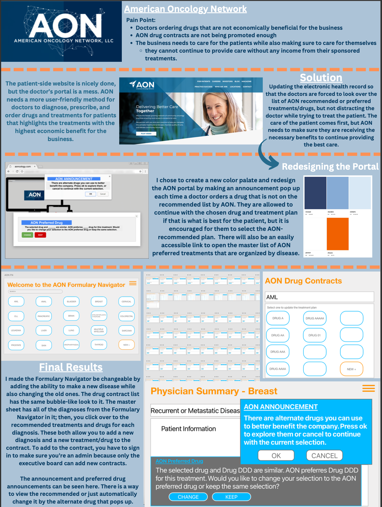
AON Portal Redesign
Solving Business Pain Points Through User-Centered Design
The American Oncology Network (AON) faced a critical “pain point”: doctors frequently prescribed treatments without knowing which options were most cost-effective for the organization. This project involved auditing the existing doctor portal and designing a strategic UI/UX solution that balances high-quality patient care with business sustainability.
Project Specifications
Role: UI/UX Designer & Prototyper
Context: FMX 311: UI/UX | University of Tampa
Tech Stack: Adobe InDesign, Adobe Dreamweaver, MacBook Air
Deliverables: Design Proposal (PDF), Interactive Prototype, Walkthrough Video
The Challenge: The "Business vs. Practice" Gap
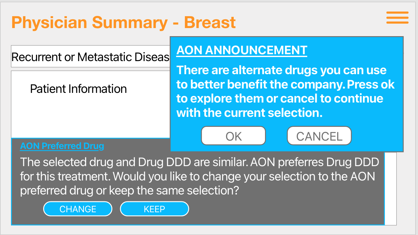
The existing doctor portal was identified as “a mess,” failing to effectively promote AON’s drug contracts. Physicians often defaulted to familiar treatments rather than new, company-sponsored options simply because the information wasn't easily accessible during the diagnostic workflow.
Key UI/UX Objectives:
Identify Friction: Pinpoint why doctors were bypassing preferred drug lists.
Seamless Integration: Introduce economic data without distracting the doctor from patient care.
Behavioral Nudging: Use UI elements to encourage smarter prescribing habits.
The Process: Research to Prototype
To solve AON’s problem, I followed a structured design methodology:
Defining the Pain Point: I analyzed how the lack of transparency in the current portal led to lost revenue.
Visual Overhaul: I developed a new color palette and modernized the interface to improve readability and professional trust.
The "Pop-Up" Intervention: I designed an automated announcement system that triggers when a non-recommended drug is selected, offering an immediate alternative.
Interactive Prototyping: Using Dreamweaver, I built a functional walkthrough of the "Formulary Navigator," showing how admins can update contracts and how physicians receive real-time feedback.
Reflection: What I Learned
This project was a great lesson in how UI/UX design can solve real business problems. I learned that a 'good' design isn't just about looks; it's about how the interface guides user behavior. The hardest part was finding a way to show the doctors alternative drug options without being annoying or getting in the way of their work with patients. By using a simple pop-up system, I was able to give them the information they needed right at the moment they were making a decision.
Looking Ahead: Ethical UX & Future Iterations
If I were to keep working on this, I’d want to dive deeper into the ethics of nudging in healthcare. It’s essential to make sure the UI always puts patient health first. I’d also look into adding more data visualization to the 'Formulary Navigator' so doctors could see a quick side-by-side comparison of drug benefits and patient outcomes. My goal is to use these UX principles to create professional tools that help businesses grow while still providing the best possible service to their users.