
Eye-Tracking for Enhanced User Engagement and Marketing Analytics
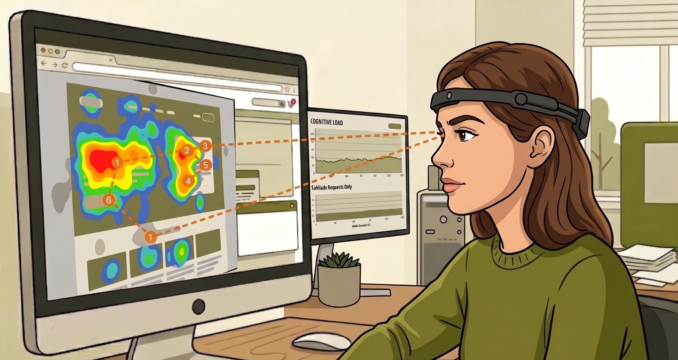
Figure 1, Figures 36-45
Addressing the
74% Website Abandonment Rate

The Question:
How can eye-tracking data be used to optimize digital interfaces and improve user engagement?
Figure 2
The Idea:

Compare self-reported preferences to actual, physiological behavior using eye-tracking.
Figure 3
The Mission: Bridging Perception and Reality:
Complete a two-part project

Figure 4
A Preliminary Digital Survey
The purpose of this survey was to capture self-reported user perceptions regarding layout preferences and advertisement engagement, establishing a baseline of how users believe they interact with digital interfaces.
&
Figure 1
An Eye-Tracking Study
The goal of this controlled laboratory experiment was to utilize high-precision gaze data to identify the objective physiological markers, such as fixations and saccades, that either facilitate deep cognitive engagement or trigger visual frustration.
Part 1: Preliminary Digital Survey
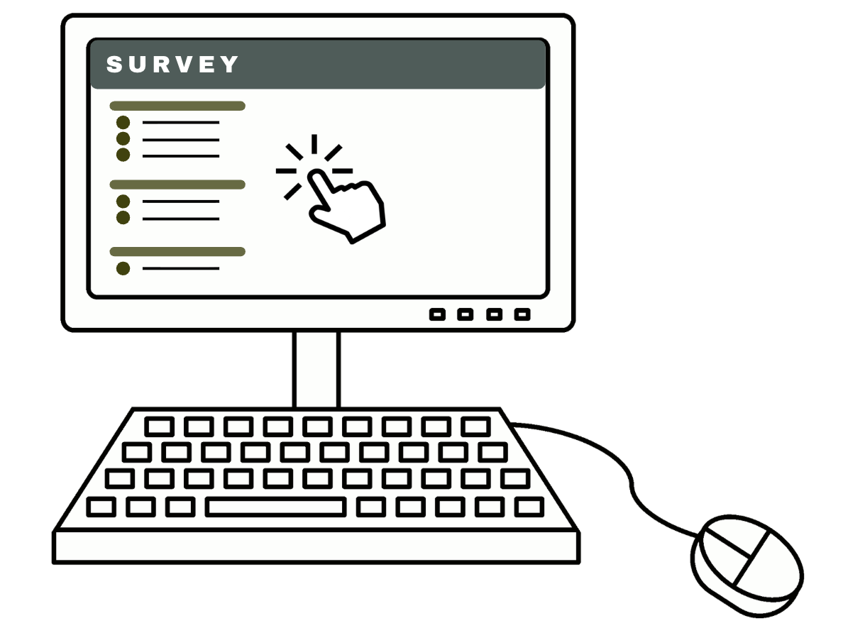
Figure 5
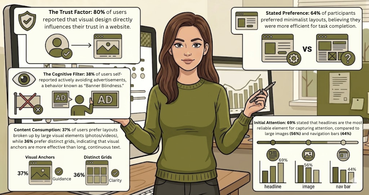
77 individuals completed a survey with topics on:
Layout Preferences: choose between broken-up layouts or dense layouts
Ad Perception: awareness level of all types and placements of advertisements
Digital Interaction Habits: screen time and device usage affect information-seeking patterns
Subjective Usability: trustworthiness and ease of use of various existing web platforms
Results:
Figure 6
Part 2: Eye-Tracking Study
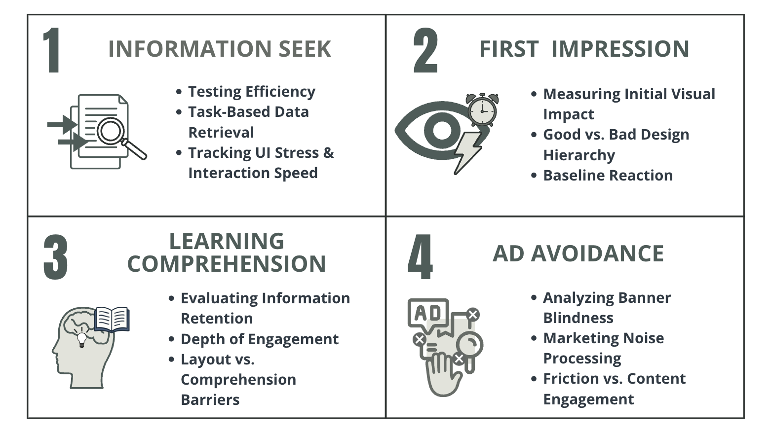
Figure 7
16 individuals completed a study in four phases:
Information Seek
First Impression
Learning Comprehension
Ad Avoidance
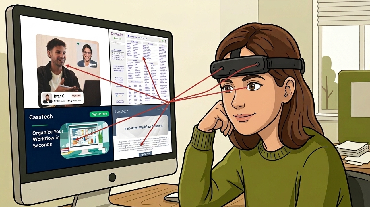
Phase 1: Information Seek
Optimized Website:
Asked to find a tutor with specific requirements
Figure 8
Testing efficiency and data retrieval for optimized and non-optimized layouts on existing websites and created digital graphics

Figure 9
Figure 10
Non-Optimized Website:
Asked to find how to contact the seller under the free section.

Asked to look at both graphics and determine which one they prefer and why
Figure 11
Optimized Graphic:
Uses pictures, little text, and bright colors to attract users’ eyes.
Figure 12
Non-Optimized Graphic:
Uses text walls, different placement of CTA buttons, and light colors with minimal contrast.
Phase 2: First Impression
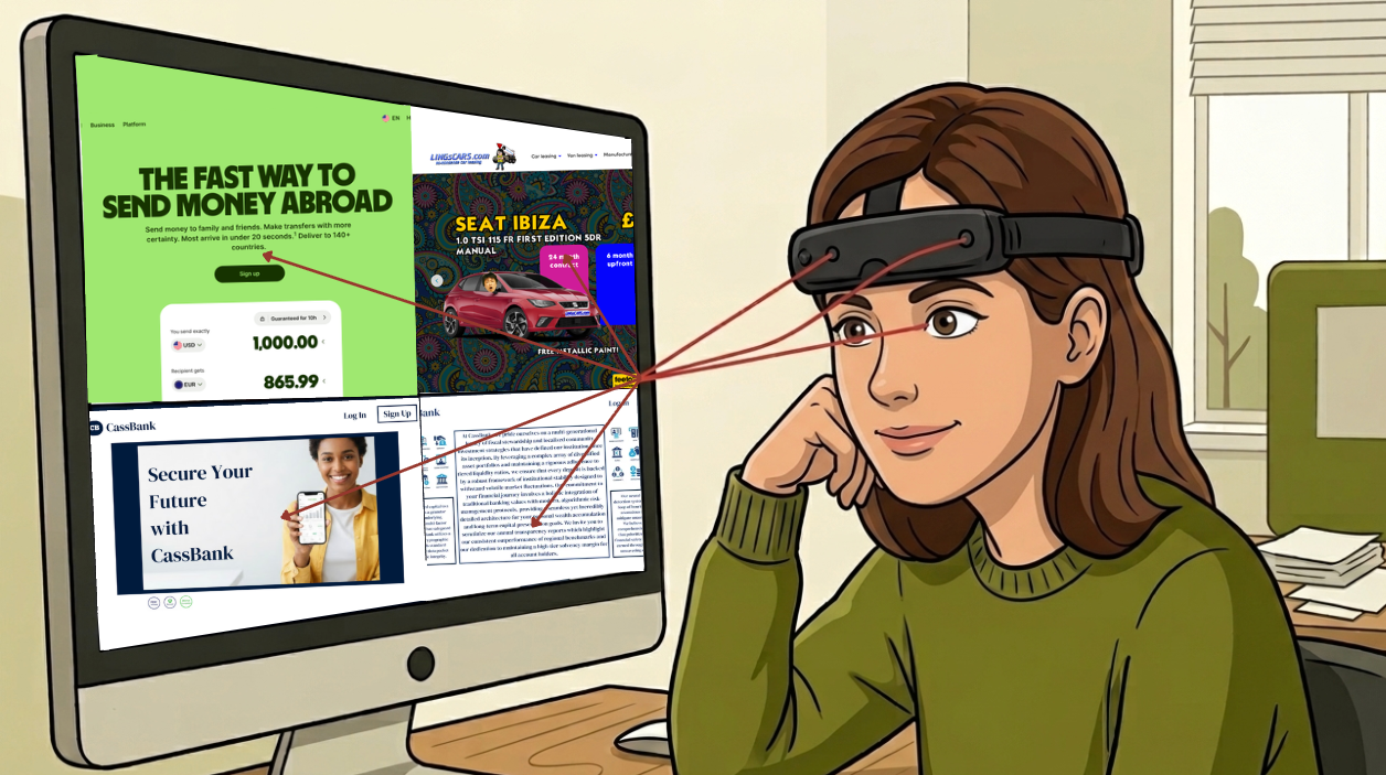
Figure 13
Testing efficiency and data retrieval for optimized and non-optimized layouts on existing websites and created digital graphics
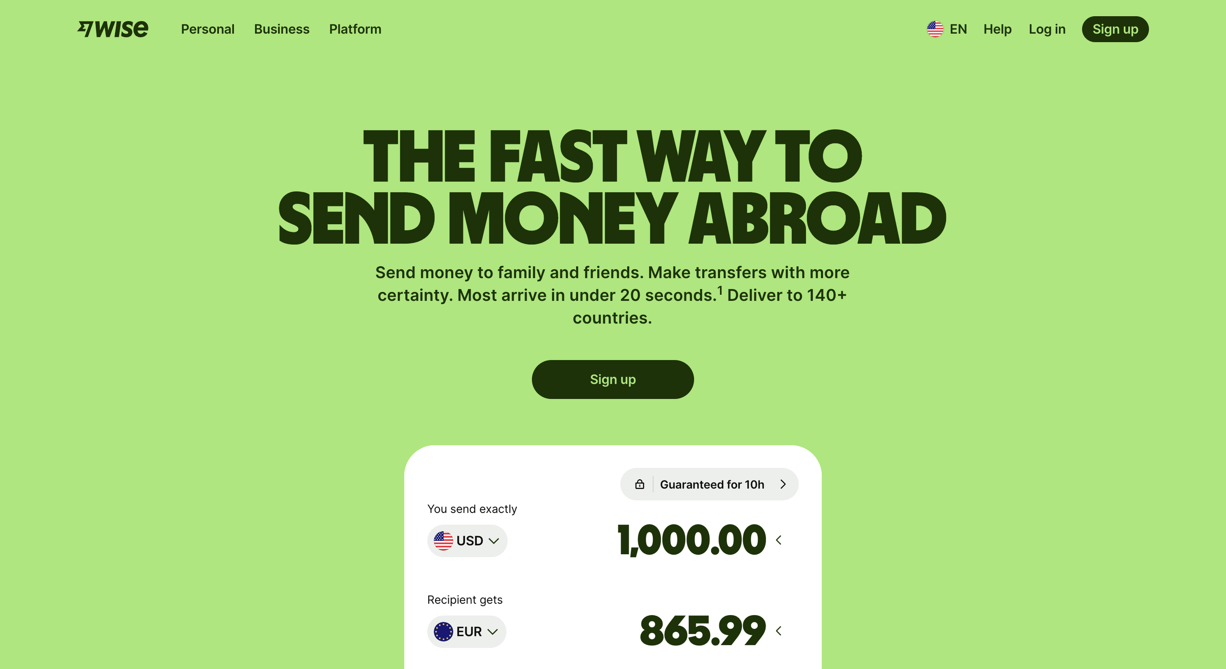
Figure 14
Optimized Website:
Asked to discover the company’s primary service in 10 seconds
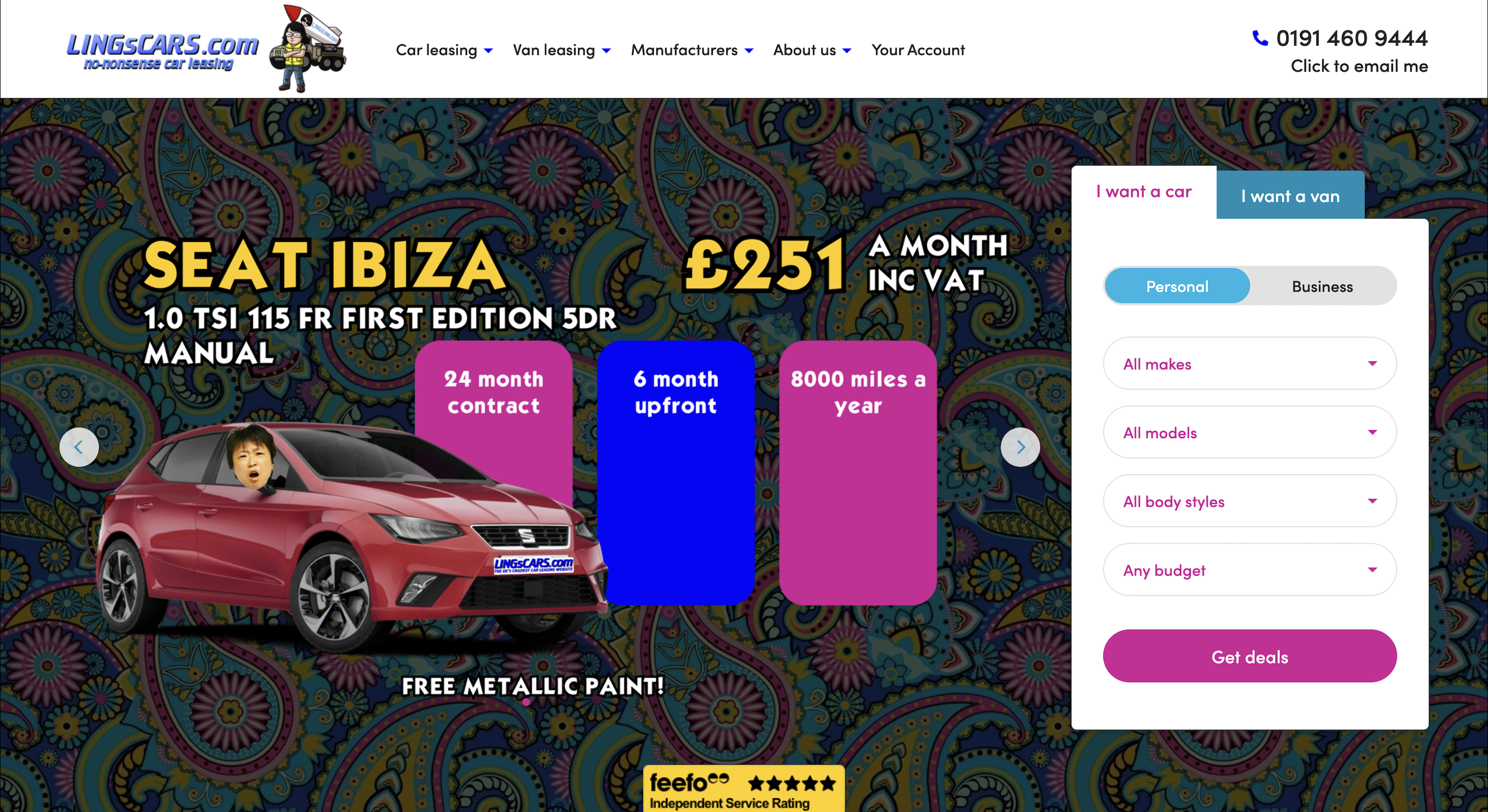
Figure 15
Non-Optimized Website:
Asked to find the link to purchase a car lease
Asked to look at both graphics and determine which one they prefer and why
Figure 16

Optimized Graphic:
Uses minimalism and little text to establish trust and comfort
Figure 17
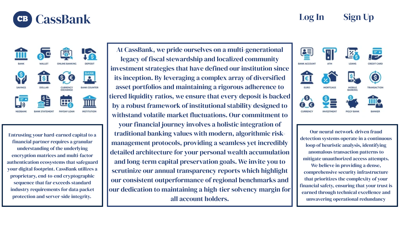
Non-Optimized Graphic:
Uses text walls and small graphics to establish trust and comfort
Phase 3: Learning Comprehension
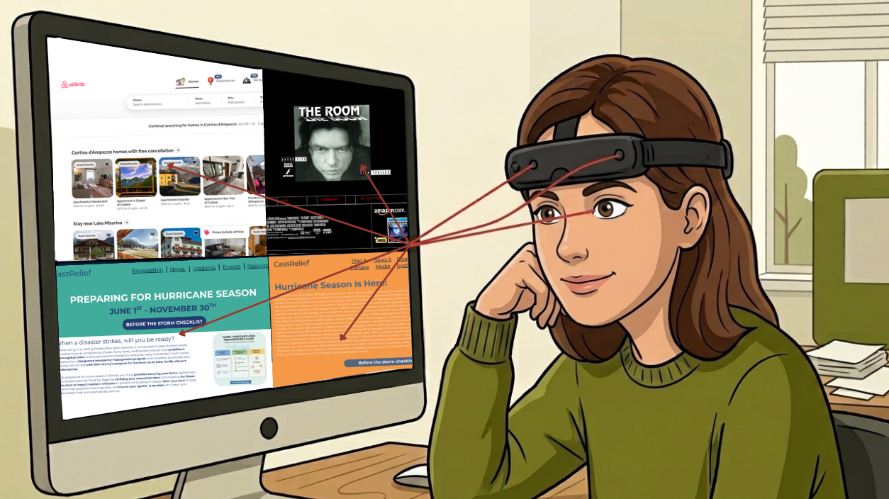
Figure 18
Testing efficiency and data retrieval for optimized and non-optimized layouts on existing websites and created digital graphics
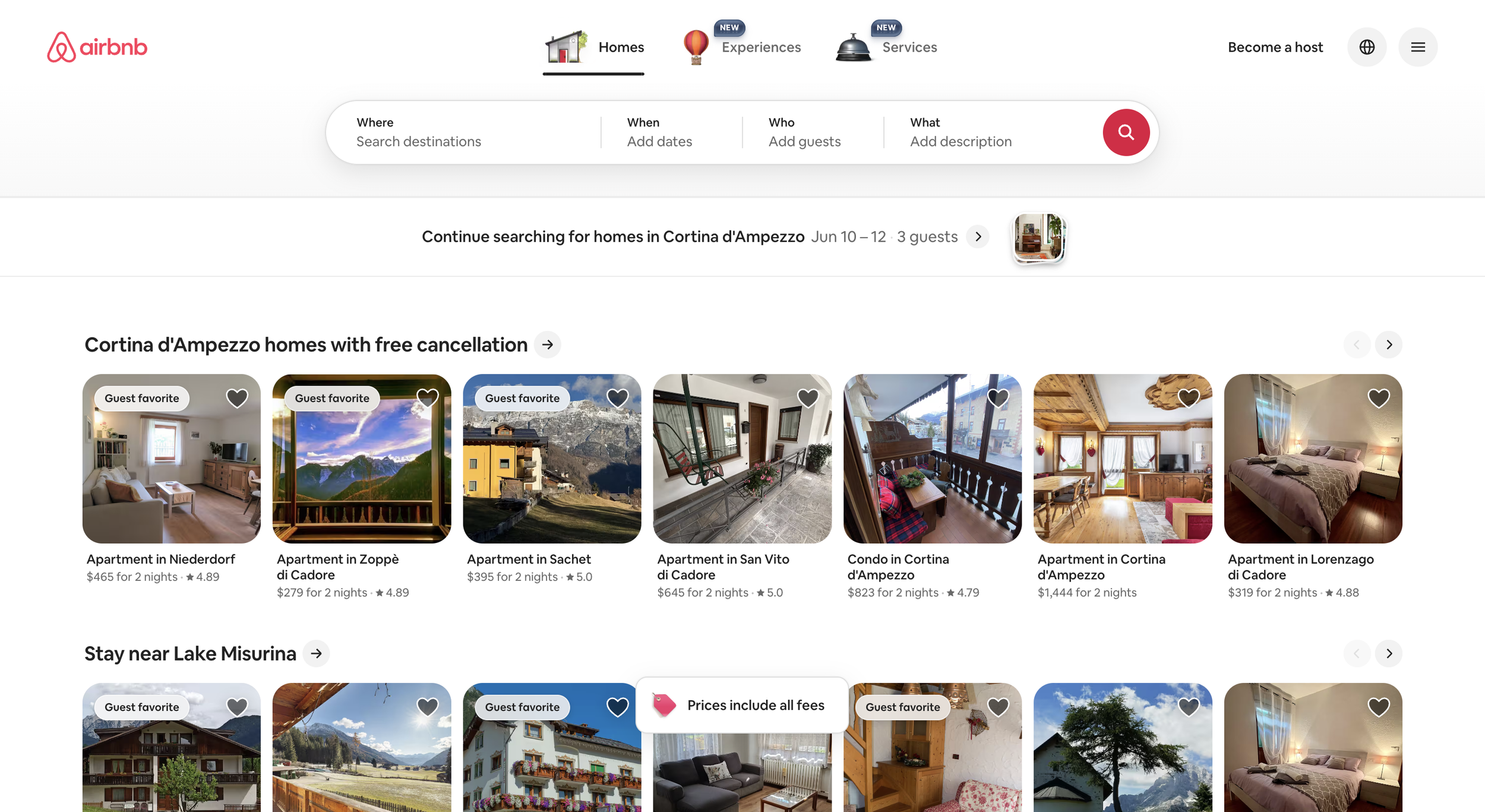
Figure 19
Optimized Website:
Asked to find a place to stay with specific requirements
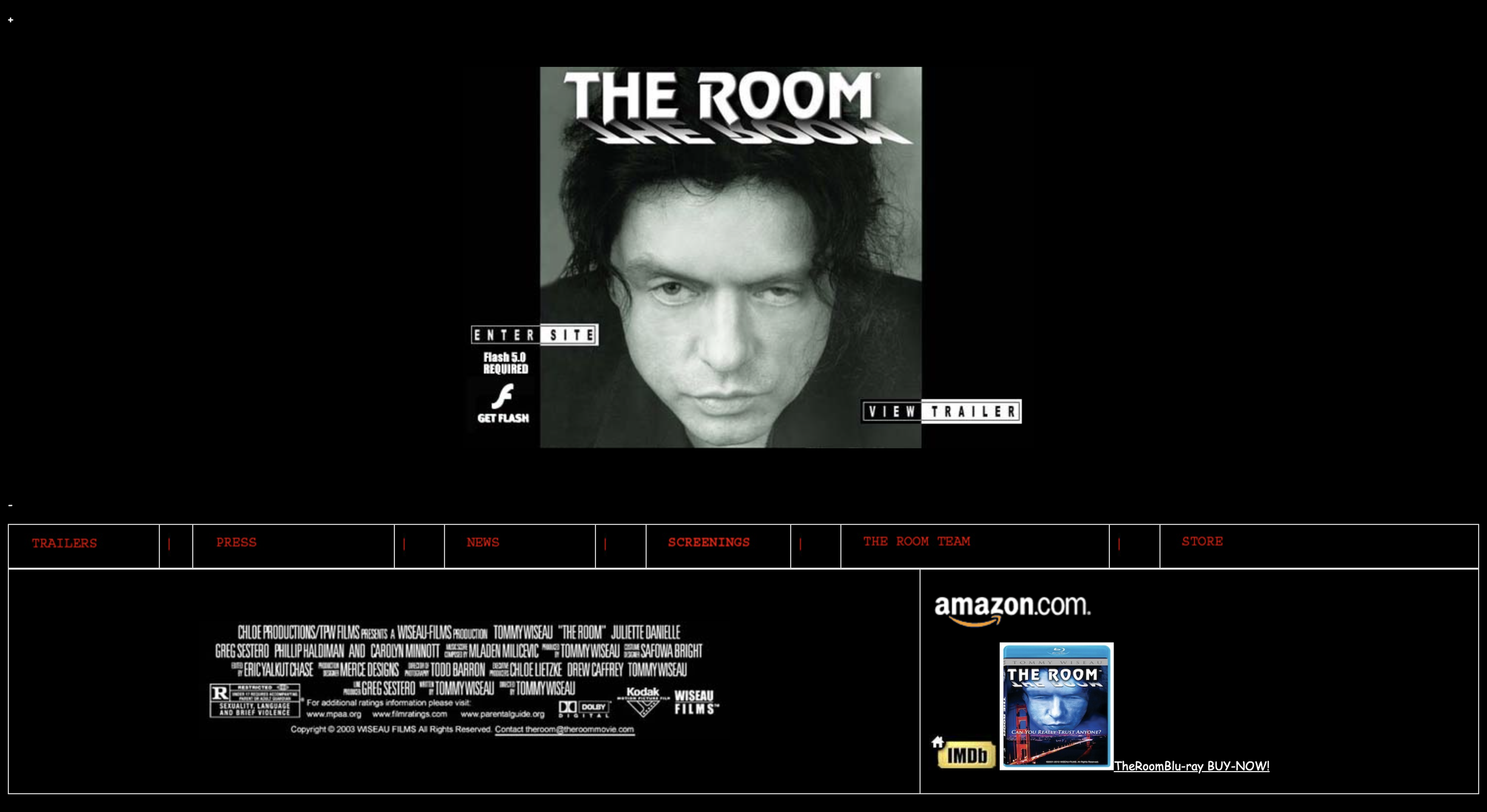
Figure 20
Non-Optimized Website:
Asked to find the link to purchase and the date of the next live appearance
Figure 21
Asked to look at both graphics and determine which one they prefer and why

Figure 22
Optimized Graphic:
Uses pictures, contrasted text, bright colors, and highlighted CTAs to attract the users’ eyes to relay information

Non-Optimized Graphic:
Uses text walls, different placement of CTA buttons, lengthy navigation headers, and light colors with minimal contrast to relay information
Phase 4: Ad Avoidance
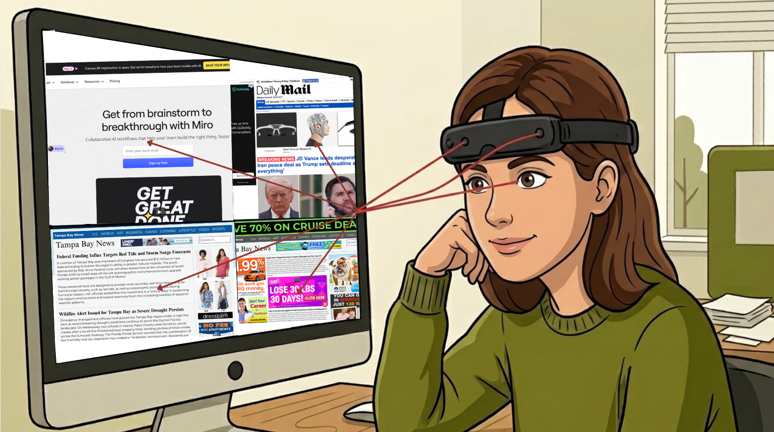
Figure 23
Testing efficiency and data retrieval for optimized and non-optimized layouts on existing websites and created digital graphics
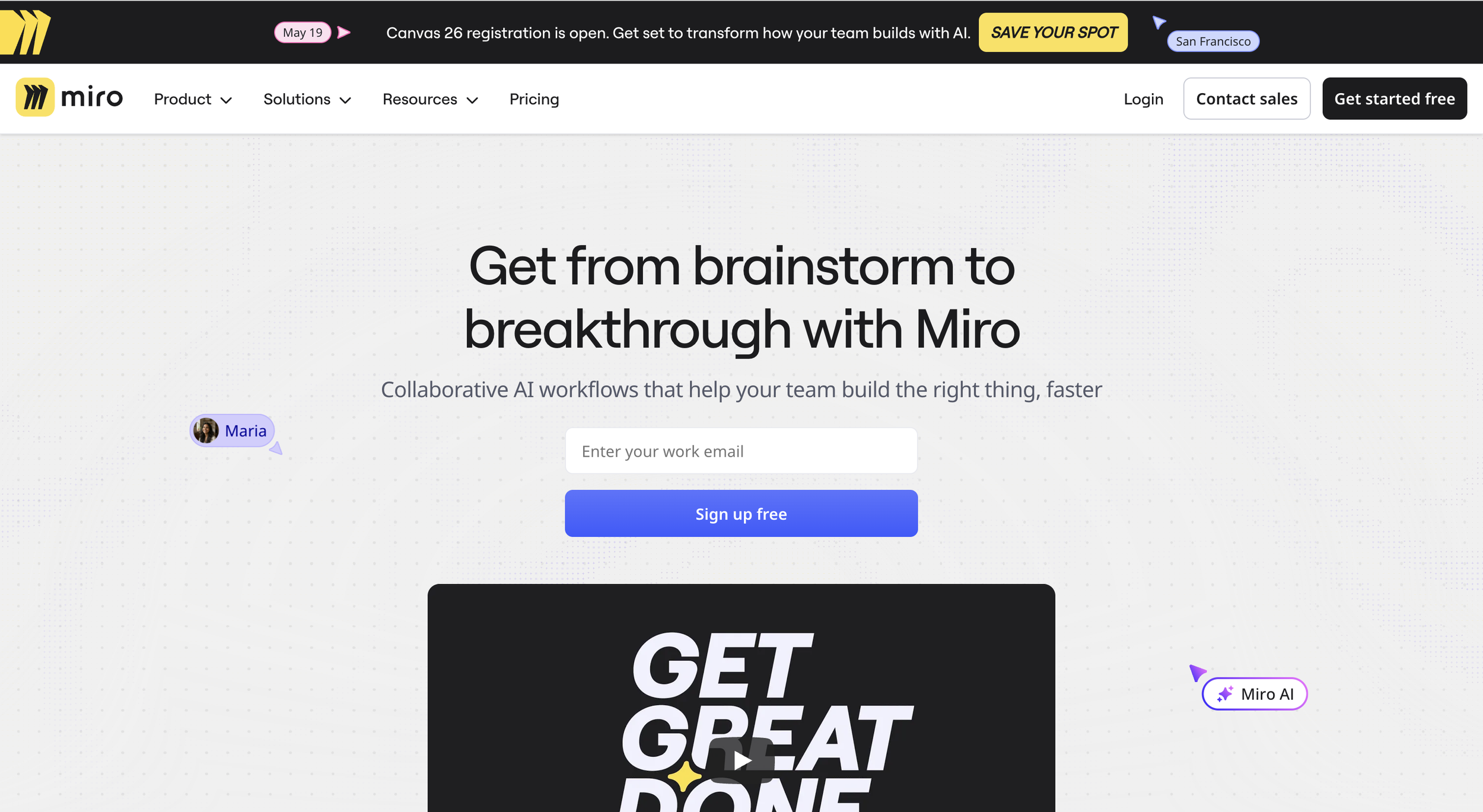
Figure 24
Optimized Website:
Asked to find the pricing link and identify the cost of the ‘Business’ plan per member
Figure 25
Non-Optimized Website:
Asked to scroll through the site and find two different stories that catch their eye
Figure 26
Asked to look at both graphics and determine which one they prefer and why
Figure 27
Optimized Graphic:
Implements natural advertisements that follow the current site structure

Non-Optimized Graphic:
Implements all types of advertisements that do not follow the current site structure or information
Analyzing the Results
Ditching Visual Labor to Create Cognitive Depth
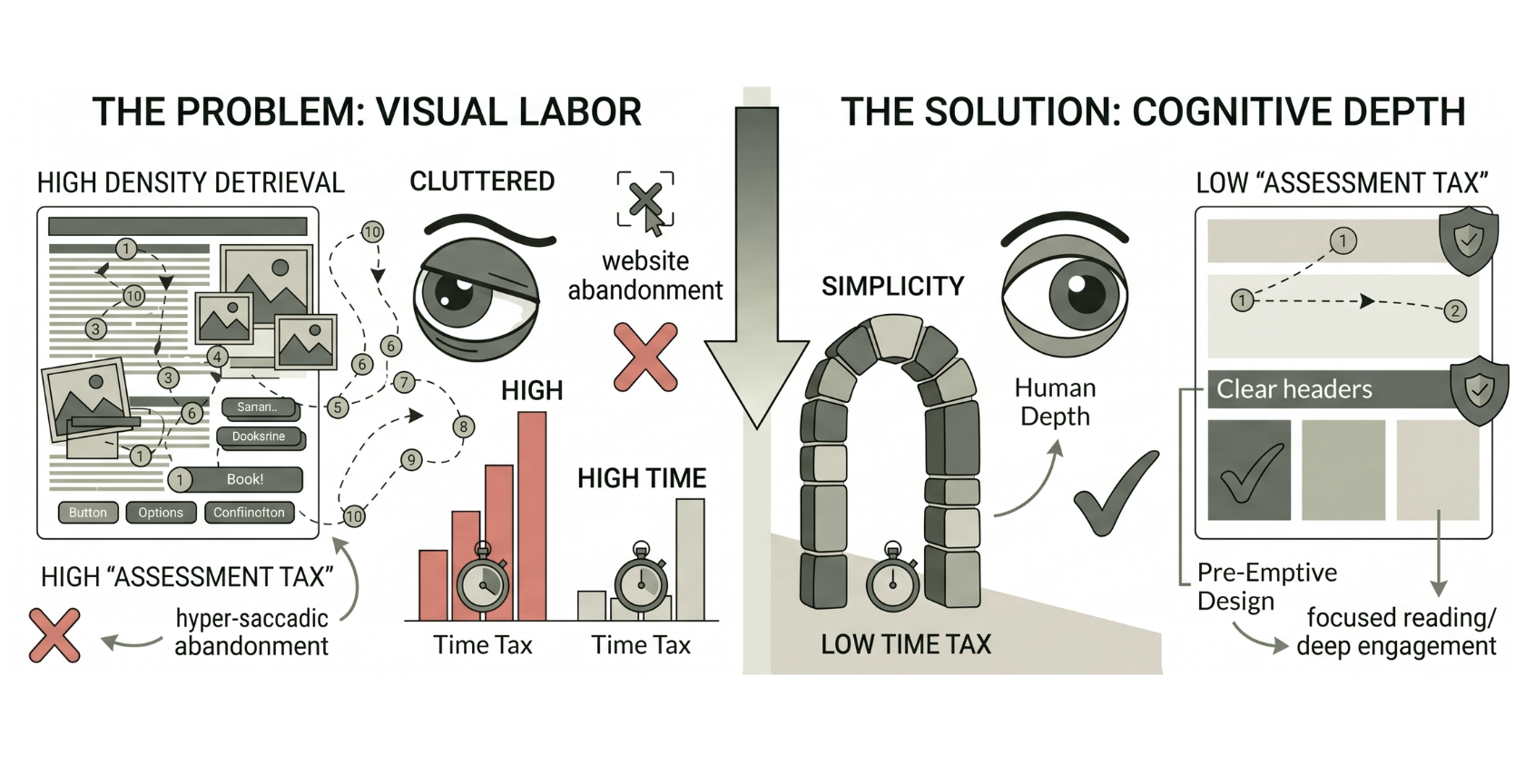
Figure 28
Three Key Findings:
1) The Density Gap
The measurable discrepancy between a user's stated preference for minimalist aesthetics and their actual physiological need for strategic visual anchors to achieve deep cognitive engagement.
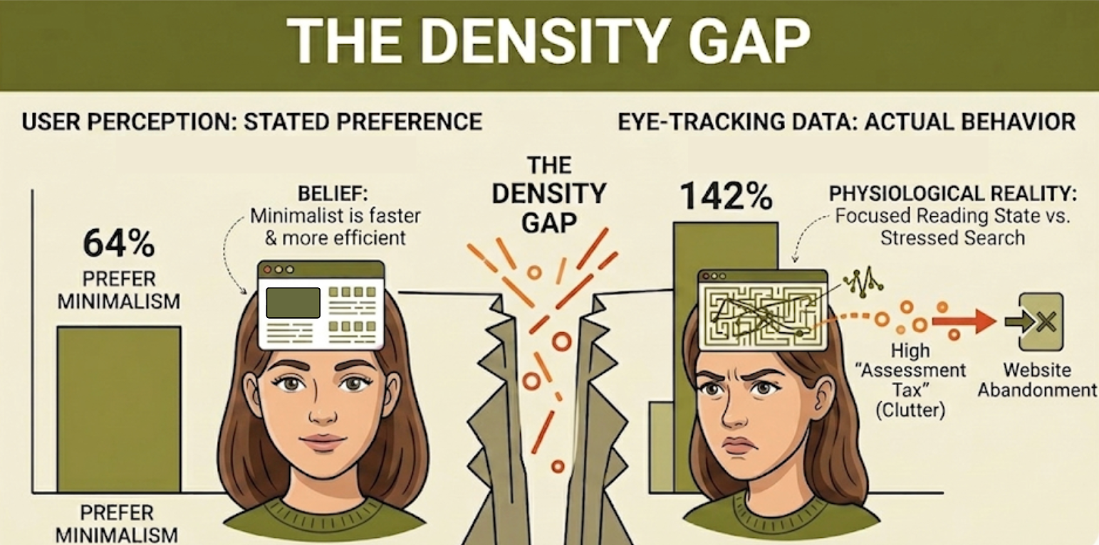
Figure 29
1) Subjective Belief: 64% of users state a preference for minimalist design, associating it with speed and efficiency
2) Physiological Reality: Users actually spent 142% more time engaging with minimalist interfaces compared to cluttered ones
3) The Conflict: Survey results suggested “search-and-escape” intent, but biometric data proved minimalism is the only environment that facilitates a Focused Reading State
4) The Conclusion: While users think they want less for speed, they actually need less to achieve deep cognitive depth and brand trust
2) The Assessment Tax
The “visual labor” required to form a first impression, where cluttered designs force users to perform 2.7x more fixations just to orient themselves within the interface.
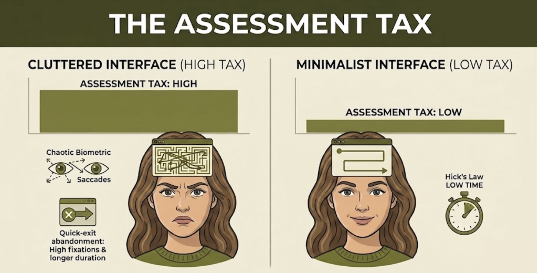
Figure 31
1) Fixation Intensity: Cluttered interfaces required 2.7x more fixations (116.9 vs. 42.1) than minimalist designs just to form an initial impression.
2) Cognitive Friction: High-density environments forced users to spend 3.3x longer simply orienting themselves before performing a task.
3) The “Search-and-Escape” Trigger: High fixation counts paired with short durations (sub-200ms) confirmed users were scanning to find an exit, not to absorb content.
4) Hick’s Law Validation: Physiological data proved that as interface complexity increases, the brain’s "assessment time" rises exponentially, leading to immediate site abandonment.
3) The Time Tax
A measurable physiological delay where poor visual hierarchy and clutter force the brain into a “Stressed Search State,” increasing initial orientation time by up to 3.3x compared to optimized designs.
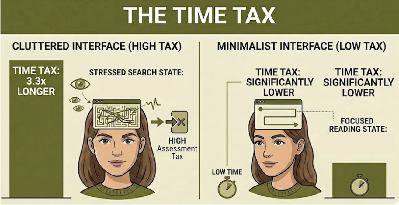
Figure 30
1) The Orientation Tax: Cluttered environments forced a 3.3x increase in the time required for initial user orientation.
2) Biometric Friction: Frantic search patterns recorded an average of 4.2 saccades per second on non-optimized sites.
3) The Minimalist Gain: Optimized layouts reduced movement frequency by 50%, transitioning the brain from a "Stressed Search State" into stable absorption.
4) The Bottom Line: High visual density acts as a biological barrier, causing users to abandon the site before they ever reach a focal point.
The Overall Result:
Minimalistic designs are ideal for fostering positive user engagement, proving that simplicity is not an aesthetic choice but a functional requirement.
The Strategic Design Framework
Principles for Optimizing Engagement
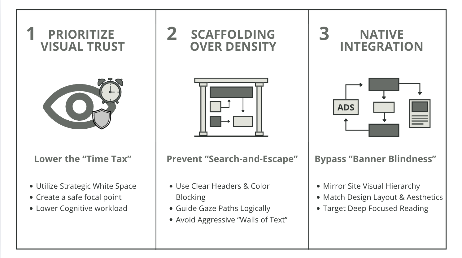
Figure 32
While some dense layouts may work, it is recommended to follow this framework for the most optimized designs that keep users engaged and help them enjoy their online experience.
Looking Forward
Limitations and Future Revisions
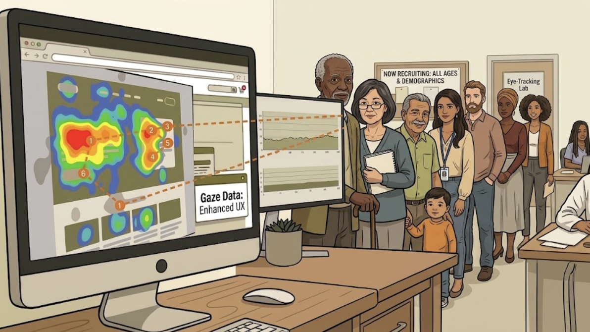
Figure 33
Demographic Narrowness
This study’s participants were majority within the Generation Z age range.
Future research should investigate whether digital natives have developed more resilient cognitive filters than older generations, or whether the cost of cluttered design is a universal biological constant.
Understanding whether visual labor' is a biological constant or a generational adaptation is key to designing for the next billion users.
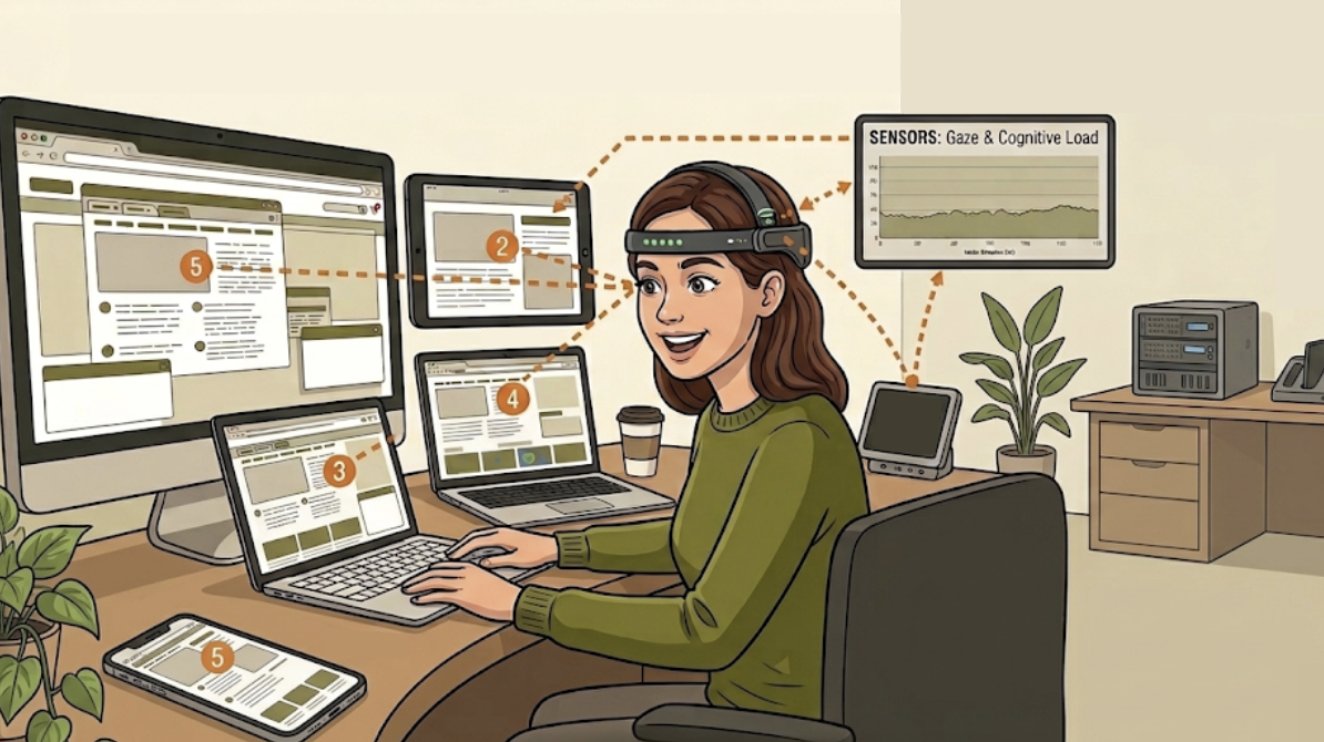
Figure 34
Desktop Only Scope
This study only observed eye-tracking on a desktop computer.
As digital use increasingly moves to smaller screens, the Density Gap, or need for more white space on the screen, likely becomes more punishing and pronounced on these mobile devices.
The Future of Design
From Analysis to Action: Designing for Depth
This research began as a quest to quantify visual frustration, but it concluded as a blueprint for human-centered design.
By proving that simplicity is a functional requirement rather than just an aesthetic choice, I’ve shifted my approach from creating interfaces that are merely “clean” to building environments that actively protect a user’s cognitive resources.
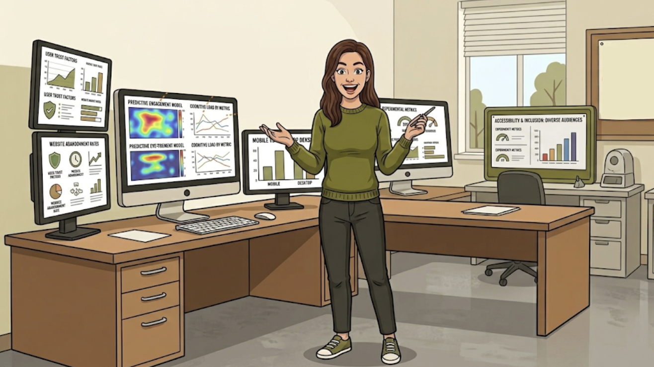
Figure 35
Moving forward, my design philosophy is rooted in the belief that every pixel should earn its place. Whether I am optimizing for a desktop experience or navigating the heightened Density Gap of mobile screens, my goal remains the same: to minimize the Assessment Tax and eliminate the Time Tax, allowing users to move past the struggle of searching and into the state of focused engagement.