
Honors Thesis
Eye-Tracking for Enhanced User
Engagement and Marketing Analytics
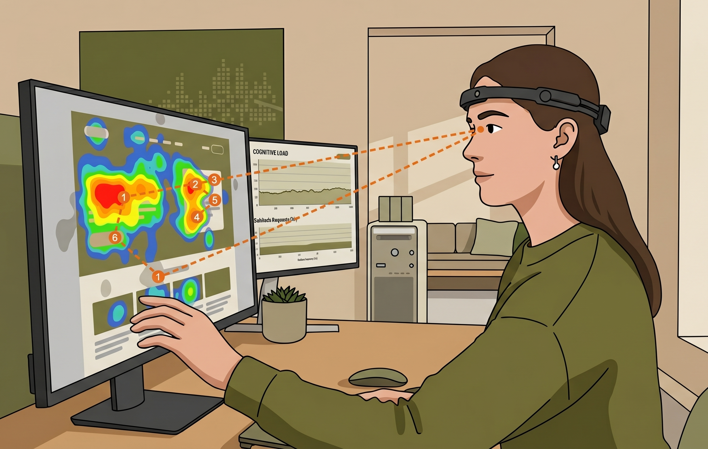
Figure 1: Illustration of an eye-tracking heatmap, created via Gemini AI
Proving that simplicity is not an aesthetic choice, but rather a functional requirement.
The Problem: 74% of users abandon their
online experience when technology
becomes an obstacle rather than a bridge.
Bridging the Gap Between Perception and Behavior
The initial phase of this research established a baseline of self-reported digital habits through a survey of 77 participants, ranging from students to professionals, which was later compared with their physiological behavior in the eye-tracking study.
Phase 1: Preliminary Digital Survey
Examining:
Layout Preferences: Participants were asked to choose between broken-up layouts and dense layouts.
Ad Perception: Users self-reported their awareness level of all types and placements of advertisements.
Digital Interaction Habits: The survey tracked daily screen time and device usage to determine if high-frequency tech users exhibited faster information-seeking patterns.
Subjective Usability: Participants rated the perceived trustworthiness and ease of use of various existing web platforms.
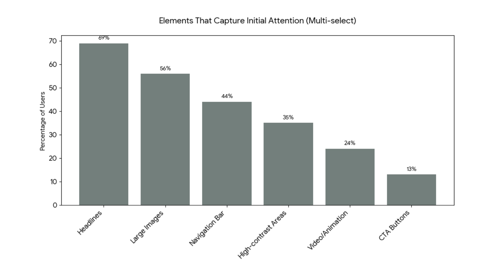
Figure 2: Visual Anchors: Self-Reported Elements That Capture Initial Attention
Key Survey Findings:
The Trust Factor: 80% of users reported that visual design directly influences their trust in a website.
Stated Preference: 64% of participants preferred minimalist layouts, believing they were more efficient for task completion.
The Cognitive Filter: 38% of users self-reported actively avoiding advertisements, a behavior known as “Banner Blindness.”
Content Consumption: 37% of users prefer layouts broken up by large visual elements (photos/videos), while 36% prefer distinct grids, indicating that visual anchors are more effective than long, continuous text.
Initial Attention: 69% stated that headlines are the most reliable element for capturing attention, compared to large images (56%) and navigation bars (44%).
Phase 2: Controlled Eye-Tracking Laboratory Experiment
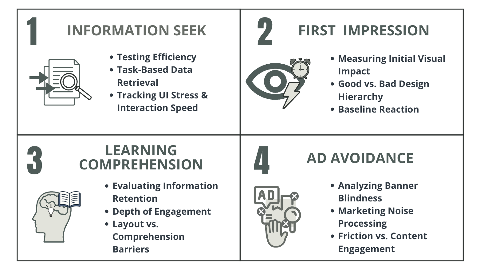
Figure 3: Experimental Architecture: Four-Stage Framework for Measuring User Engagement
Physiological Proof of Visual Labor
To test these perceptions, high-precision laboratory sessions were conducted with 16 participants of diverse technological and educational backgrounds using the iMotions Biometric Research Platform. These sessions consisted of four tasks, each measuring a different element of user engagement and interaction:
Information Seek
First Impression
Learning Comprehension
Ad Avoidance
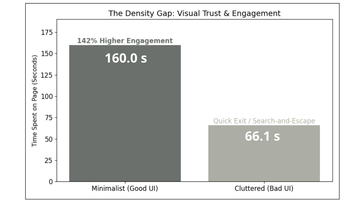
Figure 4: The Density Gap: Comparison of Time Spent on Page between Minimalist and Cluttered User Interfaces
Task 1: Information Seek
The Density Contradiction
The Density Gap: Participants spent 142% more time (160s) engaging with minimalist layouts compared to cluttered sites (66.1s).
“Search-and-Escape”: Cluttered environments were treated as quick-exit tools, while minimalist designs encouraged users to linger and explore.
Visual Trust: The increased dwell time on minimalist sites indicated a significant boost in visual trust and engagement quality.
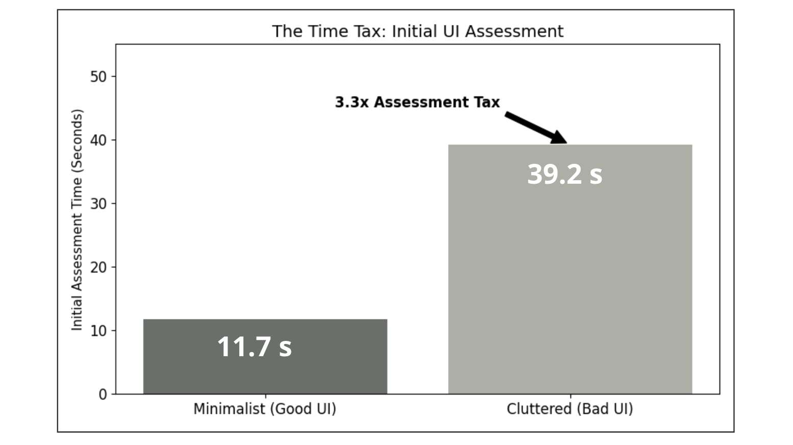
Figure 5: The Time Tax: Mean Initial Assessment Time for Minimalist (Good UI) and Cluttered (Bad UI) Designs
Task 2: First Impression
The Assessment Tax
Initial Fixations: Cluttered interfaces required 2.7x more fixations (116.9) to form an initial impression than minimalist sites (42.1).
Immediate Friction: High-density environments created measurable visual friction, causing users to take 3.3x longer to orient themselves.
High-Alert Search: The brain was forced into a high-alert search pattern on poor layouts, characterized by a mean fixation duration of only 198ms.
Hick’s Law Confirmation: This study provides physiological proof that the time required for a user to make a decision increases exponentially with the number and complexity of choices presented (Nielsen, 2012).
Beyond Click Speed: While traditional research focuses on physical reaction time, my data confirms that the delay begins in the eye as it struggles to orient itself within a poor visual hierarchy.
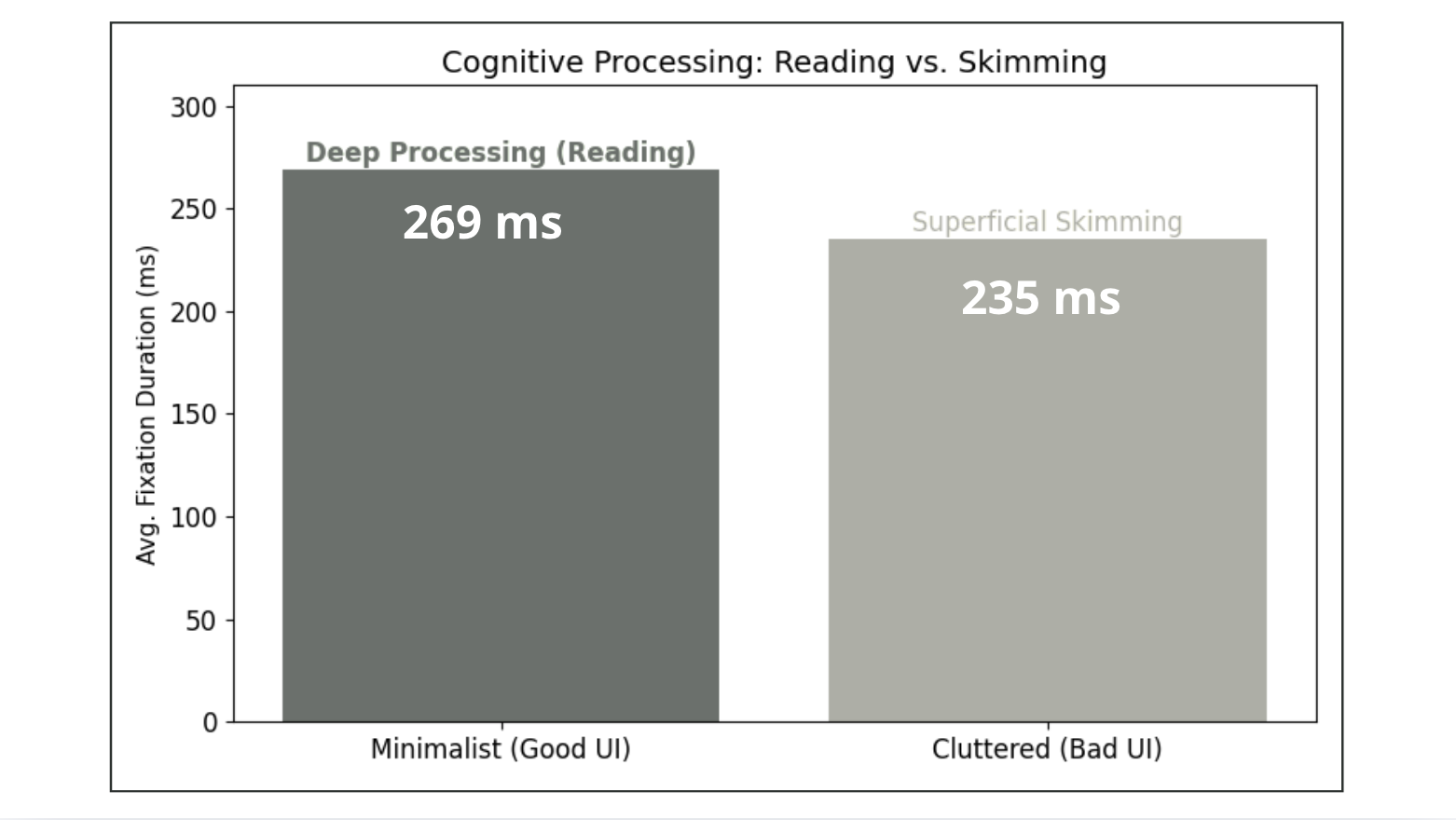
Figure 6: Cognitive Processing: Average Fixation Durations (ms) during Deep Processing (Reading) vs. Superficial Skimming
Task 3: Learning Comprehension
Deep Processing vs. Skimming
Deep Processing: Structured minimalist layouts facilitated “Focused Reading,” with deep-processing fixations averaging 269ms.
Superficial Skimming: Dense “text walls” triggered superficial skimming behavior, with shorter fixation durations of 235ms.
Cognitive Focus: Design density directly hindered information absorption, while optimized layouts promoted stable cognitive focus.
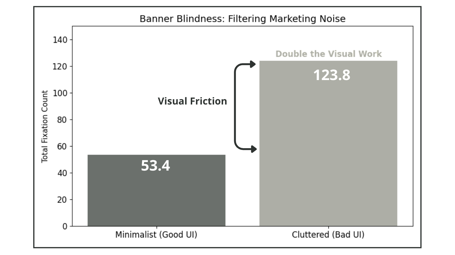
Figure 7: Banner Blindness: Total Fixation Counts as a Measure of Visual Friction in Ad-Heavy vs. Minimalist Environments
Task 4: Ad Avoidance
Banner Blindness
Banner Blindness: Users performed 131% more fixations (123.8) on ad-heavy sites just to filter out marketing noise.
Visual Friction: Advertisement-heavy environments required nearly twice as much visual work as minimalist layouts with native integration.
Subconscious Filtering: High fixation counts with low durations confirmed that users were actively blind to ads, scanning them only to ignore them.
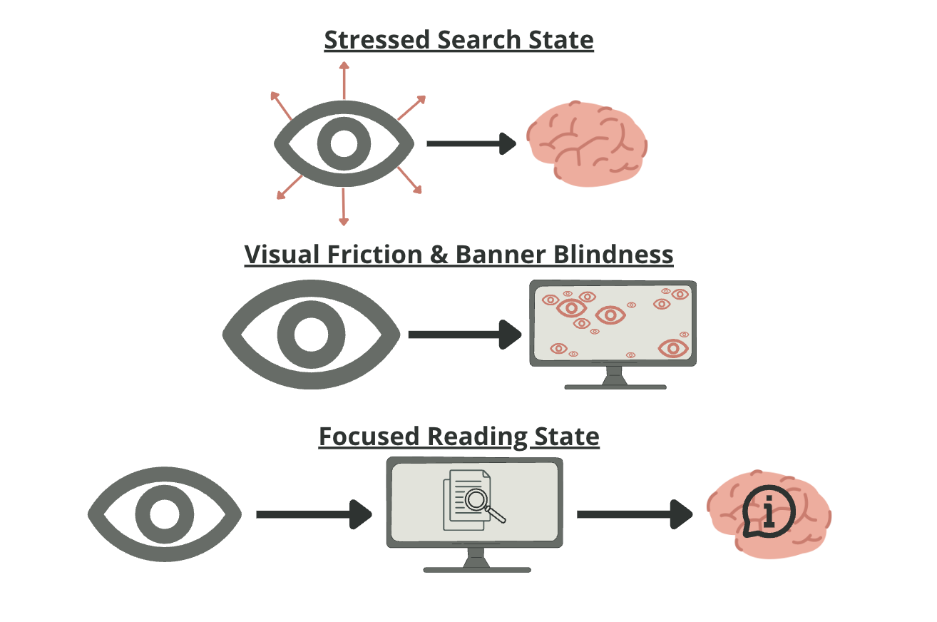
Figure 8: Biometric Transition: Physiological Markers of Visual Labor and Cognitive Depth
Biometric Proof of Visual Labor
The hard data and explanation for the observed behaviors throughout the eye-tracking study tasks:
Saccadic Velocity & Frequency: In cluttered interfaces, participants exhibited a “Stressed Search State” with a mean of 4.2 saccades per second and a peak velocity of 410 degrees per second.
The Shift to Focus: In optimized layouts, movement frequency dropped by 50% (to 2.1 saccades per second) and amplitude decreased by 56%, signaling a physiological transition into stable content absorption.
Hyper-Saccadic Behavior: Frantic eye movements traveling long distances (6.4 degrees) were recorded on non-optimized sites, compared to structured, shorter jumps (2.8 degrees) on minimalist designs
Strategic Insights and Design Framework
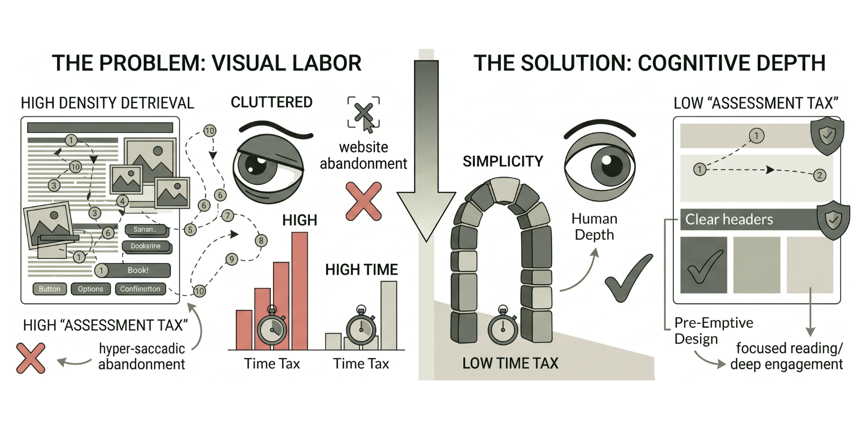
Figure 9: Illustration of Visual Labor vs. Cognitive Depth, created via Gemini AI
Minimalism as a Functional Requirement
The results of this study identify a critical “Hierarchy of Efficacy” in digital design. While well-structured, dense layouts can facilitate functional data retrieval, they fail to transition the user into the Focused Reading State required for deep brand affinity.
The Power of Less: Minimalism remains the superior strategy because it is the only environment that lowers the "Time Tax" enough to allow for true cognitive depth.
Cognitive Ease: To encourage a user to look deeper, we must show them less; simplicity is the ultimate gateway to human depth.
Strategic Scaffolding: Clear headers and color blocking create a safe cognitive environment that prevents the Stressed Search State.
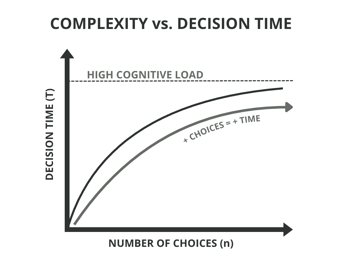
Figure 10: Hick’s Law: The Physiological Correlation Between Interface Complexity and Decision Time
Theoretical Foundations
Bridging Design and Cognitive Science
My framework is built upon established psychological principles that quantify the impact of visual complexity on human decision-making.
Hick’s Law (Complexity vs. Time): This study provides physiological confirmation that as the number and complexity of choices on a page increase, the time required for a user to make a decision rises exponentially (Nielsen, 2012).
The eye-tracking data proves this delay begins in the gaze path before a user ever reaches for their mouse.
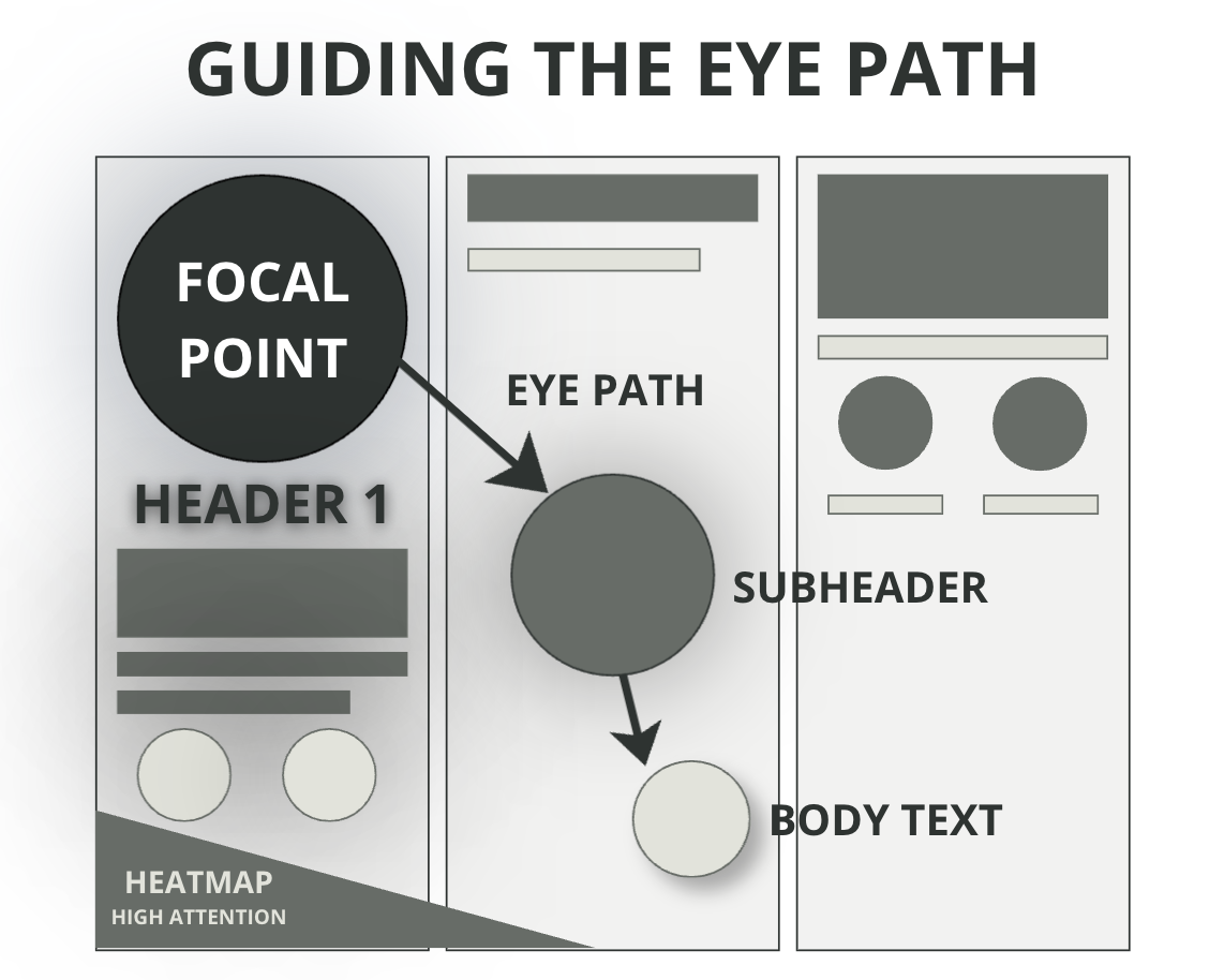
Visual Hierarchy Model (Guiding the Eye Path): By utilizing contrast, color, and positioning, designers can naturally control the user’s eye path (Nielsen & Pernice, 2009).
My research demonstrates that when these focal points are missing, the brain enters a “hyper-saccadic” state of visual labor.
Figure 11: Visual Hierarchy Model: Strategic Scaffolding and Natural Eye Movement Patterns
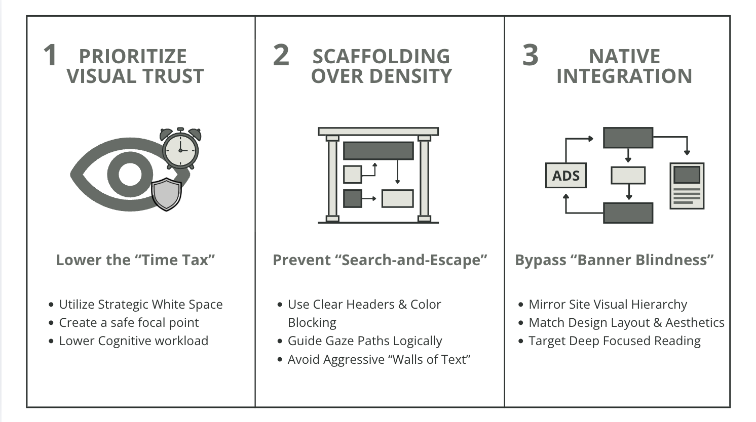
Figure 12: Strategic Design Framework: Principles for Optimizing User Engagement and Mitigating Cognitive Load
The Strategic Design Framework
Principles for Optimizing Engagement
By synthesizing these metrics, I have developed a core set of recommendations for designers and stakeholders to mitigate cognitive load and maximize digital efficiency:
Prioritize Visual Trust: Utilize strategic white space to create a safe focal point and lower the initial "Assessment Tax".
Scaffolding over Density: Use clear headers and structured anchors to prevent "Search-and-Escape" behavior on data-heavy pages.
Native Integration: Match the visual hierarchy of the site to bypass "Banner Blindness" and ensure marketing elements are processed during Focused Reading.