Personal Branding & Logo Design
Translating Personality into a Professional Visual Identity
This project involved creating a personal brand identity and a professional logo for a hypothetical production company. By combining AI-generated inspiration with traditional vector design, I developed a visual mark that is bubbly, simple, and memorable, reflecting both my personality and my professional aesthetic as a digital creator.
Project Specifications
Role: Brand Designer
Context: FMX 210: Digital Media | University of Tampa
Tech Stack: Adobe Illustrator, Midjourney (AI Generation), MacBook Air
Deliverables: Black & White and Full-Color Logo variations
The Vision: Defining “Bubbly”
The objective was to create a logo that met the six pillars of successful branding: simplicity, memorability, timelessness, versatility, appropriateness, and universality. I chose the keyword "bubbly," a trait my peers often use to describe me, as the foundation for the brand. The goal was to transform this abstract personality trait into a functional logo for my own creative production company, one that would represent the company and me.
Key Design Objectives:
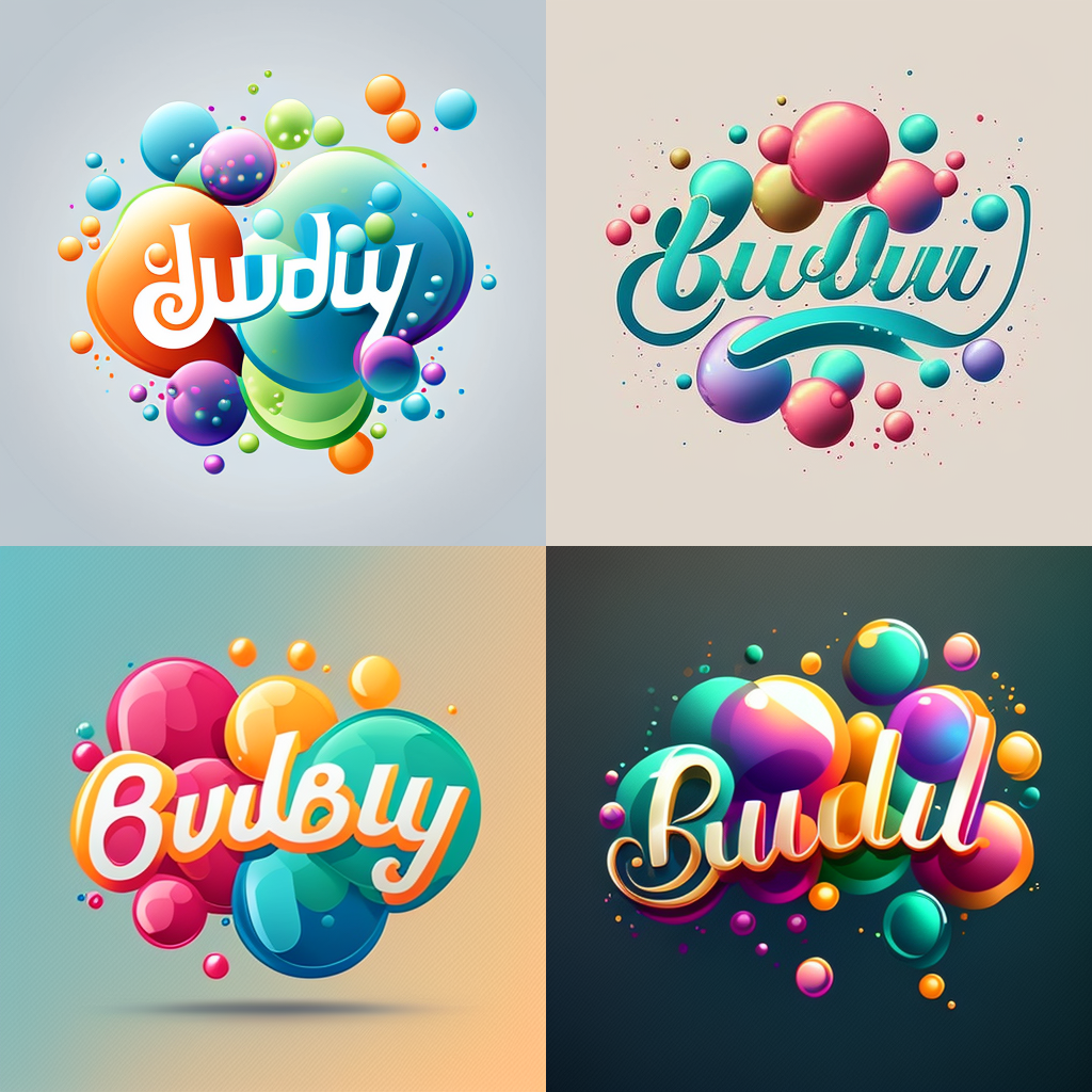
AI-Assisted Inspiration: Using Midjourney to generate initial visual concepts from the prompt "bubbly" to explore organic shapes and textures.
Vector Precision: Translating AI inspiration into clean, scalable paths in Adobe Illustrator to ensure the logo remains sharp at any size.
Color Psychology: Utilizing a bright and fun color palette to reinforce the brand's energetic and approachable persona.
The Process: From Prompt to Vector
This project highlighted the intersection of generative AI and professional graphic design software:
Conceptualization with AI: I used Midjourney to explore how the word 'bubbly' could be visually represented. This provided a starting point of shapes and bubbly characteristics that I then filtered through my own design lens.
Typography Selection: I chose a fun font that complemented the organic shapes of the mark, ensuring the text and icon felt like a unified brand for a production company.
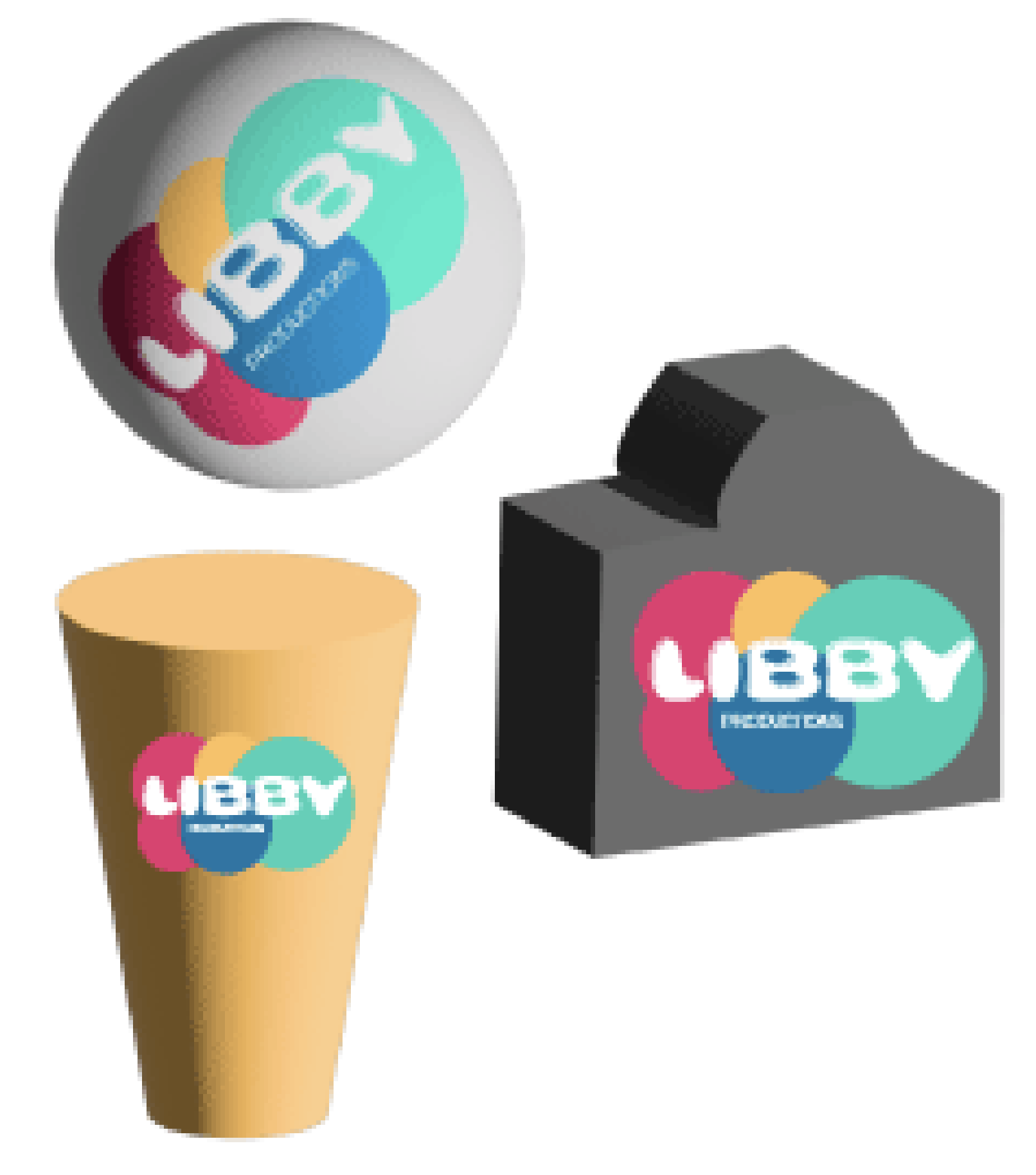
Vectorization in Illustrator: I manually built the logo in Adobe Illustrator to ensure it was universal and versatile. This also involved creating a balanced black-and-white version so the logo could be used with all color schemes and print applications.
Refinement for Versatility: I tested the logo in various sizes and color formats to ensure it met the assignment's appropriate, timeless specifications.
Reflection: What I Learned
This project was a great lesson in how to turn a personal trait into a professional brand. I really enjoyed the challenge of refining an AI-generated image into a clean, simple vector logo. It taught me that while AI is great for ideas, the designer’s job is to make those ideas functional and versatile for the real world. I am proud of how this logo represents me: it is fun and energetic, just like my approach to digital media.
Looking Ahead: Brand Identity in UX
Creating this logo helped me understand the importance of Visual Identity in User Experience. In my Honors Thesis research on eye-tracking, I’ve found that 80% of users say a site's visual design influences whether they stay or leave. In the future, I want to explore how branding and UX work together to build user trust. I believe that a strong, consistent visual identity is the first step in creating an interface that feels both intuitive and professional.